pandas’ plotting functions (built on Matplotlib) can also be used for data visualization in Excel’s built-in Python. This section covers bar charts, area charts, and histograms.
Bar Charts
In the worksheet shown in Figure 7-25, cell A7 (Python mode) inputs code to draw a composite bar chart:
df = xl("A1:C5", headers=True)
df.plot.bar()  # Composite bar chart
plt.xticks(fontsize=16)
plt.yticks(fontsize=16)
plt.legend(fontsize=16)
Press Ctrl+Enter to return an Image object. Merge cell range B7:E17 to display the result (left plot in Figure 7-25).
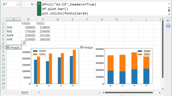
Figure 7-25
To draw a stacked bar chart, set stacked=True:
df = xl("A1:C5", headers=True)
df.plot.bar(stacked=True)  # Stacked bar chart
plt.xticks(fontsize=16)
plt.yticks(fontsize=16)
plt.legend(fontsize=16)
Press Ctrl+Enter to return an Image object. Merge cell range G7:J17 to display the result (right plot in Figure 7-25).
Area Charts
In the worksheet shown in Figure 7-26, cell A7 (Python mode) inputs code to draw a non-stacked area chart:
df = xl("A1:C5", headers=True)
df.plot.area(stacked=False)  # Non-stacked area chart(semi-transparent)
plt.xticks(fontsize=16)
plt.yticks(fontsize=16)
plt.legend(fontsize=16)
Press Ctrl+Enter to return an Image object. Merge cell range B7:E17 to display the result (left plot in Figure 7-26).
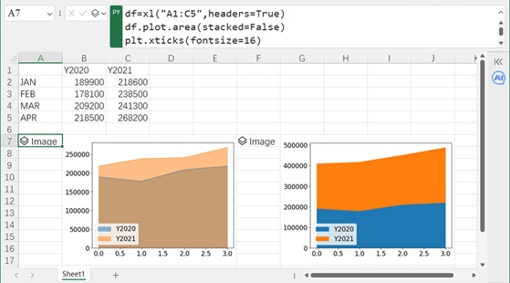
Figure 7-26
To draw a stacked area chart (default), omit stacked=False:
df = xl("A1:C5", headers=True)
df.plot.area()  # Stacked area chart
plt.xticks(fontsize=16)
plt.yticks(fontsize=16)
plt.legend(fontsize=16)
Press Ctrl+Enter to return an Image object. Merge cell range G7:J17 to display the result (right plot in Figure 7-26).
Histograms
In the worksheet shown in Figure 7-27, columns A-C contain car data. We standardize the data (columns D-F) and draw a composite histogram.
First, standardize Column A (MPG) in cell D1 (Python mode):
df = xl("A1:A407", headers=True)
std_mpg = ((df['MPG'] - df['MPG'].mean()) / df[7;MPG'].std()).round(4)  # Standardize MPG
Press Ctrl+Enter to return a Series (display as Excel values). Repeat for Columns B (Acceleration) and C (Displacement) to get std_acc and std_dis.
Then, concatenate the standardized data and draw a composite histogram:
Cell G2 (Python mode) inputs code for a semi-transparent composite histogram:
df2 = pd.concat([std_mpg, std_acc, std_dis], axis=1)
df2.plot.hist(alpha=0.5)  # Semi-transparent
plt.xticks(fontsize=16)
plt.yticks(fontsize=16)
plt.legend(fontsize=16)
plt.ylabel('Frequency', fontsize=16)
Press Ctrl+Enter to return an Image object. Merge cell range H2:L13 to display the result (top plot in Figure 7-27).
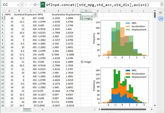
Figure 7-27
Cell G14 (Python mode) inputs code for a stacked histogram with 20 bins:
df2 = pd.concat([std_mpg, std_acc, std_dis], axis=1)
df2.plot.hist(stacked=True, bins=20)  # Stacked, 20 bins
plt.xticks(fontsize=16)
plt.yticks(fontsize=16)
plt.legend(fontsize=16)
plt.ylabel('Frequency', fontsize=16)
Press Ctrl+Enter to return an Image object. Merge cell range H14:L26 to display the result (bottom plot in Figure 7-27).
This chapter covers essential data visualization techniques using Excel’s built-in Python, leveraging Matplotlib, Seaborn, and pandas for diverse chart types and customization.